skip to main |
skip to sidebar
Dual Sided Histogram in Excel
Many of the tips at MrExcel.com are accounting-oriented. However, Excel is also a favorite tool for scientists. I recently published a new book that takes a look at Excel for Scientists and Engineers. Today's tip is taked from Gerry Verschuuren's book. Accountants create charts. Scientists create graphs. Excel can make graphs useful for scientists, but they often have to wade through charts for accountants first.Your goal is to create a two-sided histogram to show results of this data.
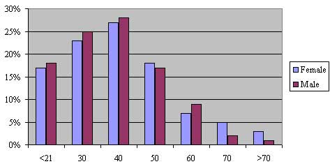 Highlight the range shown above and type the F11 key. You get a typical accounting chart as shown here.
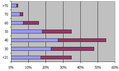 From the menu, select Chart - Chart Type. Choose a stacked bar chart. This doesn't get you much closer to a histogram.
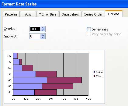 Right-click any bar and choose Format Data Series. In the dialog, choose the Options tab. Change the Gap Width to 0.
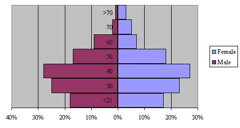
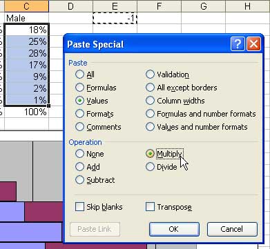 To make a dual-sided histogram, you need to show one of the series as negative. Enter the value of -1 in an out of the way cell. Select this cell and type Ctrl+C to copy the cell to the clipboard.Then, select the values for the Male series. Choose Edit - Paste Special. In the Paste Special dialog, choose Values and Multiply.
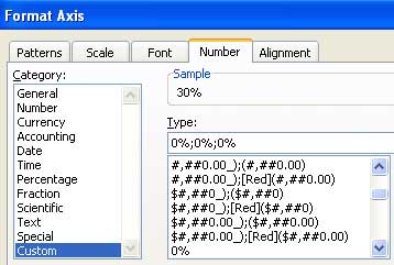 You are almost there. Right-click the percentages along the bottom of the graph. Choose Format axis. In the Format Axis dialog, apply a custom number format of 0%;0%;0%. This will prevent the left side of the chart from appearing with negative values.
 The chart is complete.
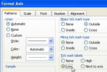 If you would like the category bins to appear on the left axis, right click the >70 label and choose Format Axis. On the Patterns tab, find the checkbox to have the labels appear as "Low".
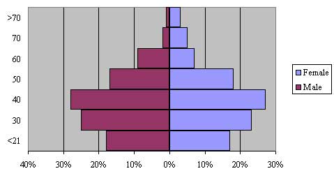 Here is the final graph. You can easily compare male vs female results for each age bin.
No comments:
Post a Comment