skip to main |
skip to sidebar
Thermometer Chart in Excel
Here is a cool technique for creating a thermometer style chart in Excel. This was sent in by Abhay Jain of New Delhi, India. When I first opened the workbook, I was completely fooled by what I saw. When you see how Abhay creates the chart, it is very clever.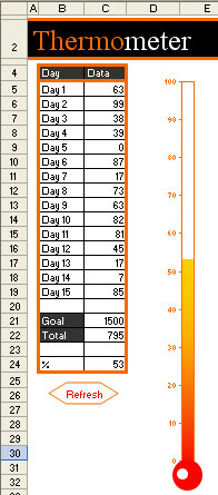 The thermometer chart is a chart based on a single data point. In a lone cell, put a formula that points towards your percentage completion towards a goal. If the original number is a percentage, multiply by 100 to get an integer value between 0 and 100.
 From the menu, select Insert - Chart. Choose a Column Chart and the first column sub-type - cluster column.Proceed to step 3 of the Wizard. On the Titles tab, ensure there is no title. On the Axes tab, uncheck the Category option. On the Gridlines tab, uncheck Major Gridlines. On the Legend tab, uncheck Show Legend. Choose Finish. You will have a fairly boring chart with one bar like this one.
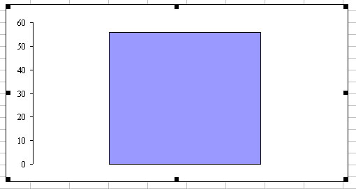 Right-click the blue bar and choose Format Data Series. On the Options tab, change the Gap Width to 0.
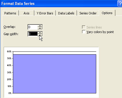 On the Patterns tab, choose the Fill Effects button.
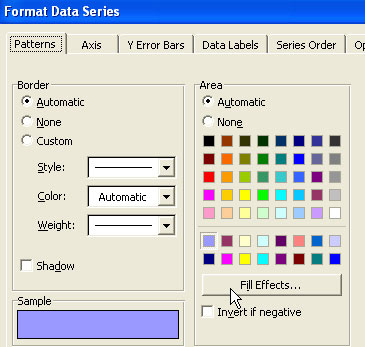 On the Gradient tab of the Fill Effects dialog, choose Two Color and select a red and orange color.
 Choose OK to close the Fill Effects dialog. Back on the Patterns tab, choose Orange for the line color. Choose OK to close Format Data Series dialog.
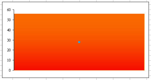 The next couple of steps are somewhat tricky. To Format the plot area, you will right-click just above the orange bar, but below the top of the chart. In my case, this is a fairly narrow strip of white - basically the four points from 56 through 60. If you happened to have a chart where the orange is to the top of the chart, it would be hard to isolate the plot area. In this case, jump ahead to reset the axis scale and then come back to this step. Right click and choose Format Plot Area.
 Change the Border color to Orange on the Format Plot Area dialog. Choose OK.Next, right-click in above the top of the chart, but still inside the outer border to select the Chart Area. Choose Format Chart Area.
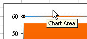 Change the Border to None and select Round Corners. Choose OK to close the Format Chart area dialog.With the chart area selected, grab the resize handle on the bottom right corner. Drag in and down to make the thermometer be narrow and long.
 During the resize, the font along the y-axis scale has become tiny. Right-click any of the numbers along the left side of the chart and choose Format Axis.On the Patterns tab, change the line color to Orange.On the Scale tab, change the Maximum to 100.
 On the Font tab, choose Arial, Orange, and type 6.5 as the font size.
 Choose OK to close the Format Axis dialog. This last step ensured that the chart extends from 0 to 100. You now have something that looks like a thermometer.If you wish, add a circle to the bottom. Display the drawing toolbar with View - Toolbars - Drawing. Select the Oval icon. While holding down the shift key, draw an oval. The shift key will constrain the oval to be a circle. Right-click the circle and choose Format AutoShape. Choose the appropriate color for the fill and the line color. Drag the circle so that it is roughly centered below the thermometer.
No comments:
Post a Comment