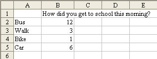
In your classroom, your students take a survey of the class and they want to display the information on a bar chart. In Excel, type the responses in several cells in column A, starting in cell A2. Enter the number of students with each answer in column B, starting in B2. Leave cell A1 blank. In cell B1, enter the question. This will be used for the title of the chart. Your data should look like this.
 Select the range of data, from the blank cell in A1, through the last cell in column B. From the menu, select Insert - Chart. In the Chart dialog box, choose a Bar Chart on the left side. In the following screen shot, you can see the cells that are selected, and the various bar chart options.
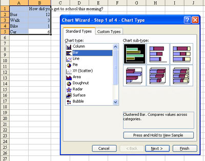 Click Next twice.In Step 3 of the Wizard, click on the Legend tab. Uncheck the box for Show Legend.
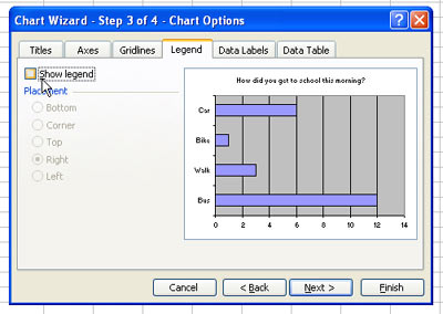 Click on the Data Labels tab. Check the box for Value.
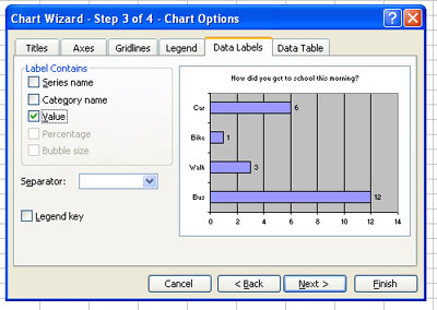 Click Next to go to the 4th step of the wizard. You can either choose to have the chart on a new sheet or embedded on a worksheet. If you want to print a full-page size version of the chart, use New Sheet.
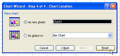 The resulting chart:
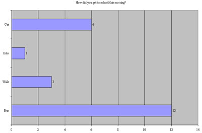 To make each bar be a different color, right click one bar and choose Format Data Series.
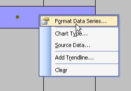 In the Format Data Series dialog, click on the Options tab and choose Vary Colors by Point.
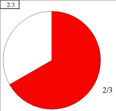
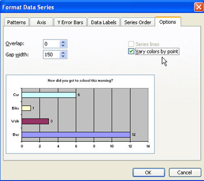 You can customize many other chart elements. If you don't like the grey background, right click on the background and choose Format plot area. You can choose another color (such as white) for the background.Pie Chart to Demonstrate Fractions
Download this workbook to demonstrate fractions.
No comments:
Post a Comment